Painting your home is one of the most cost-effective ways to increase its appeal and value, especially in a vibrant market like Aspen, Colorado. Whether you're preparing to sell or simply want to enjoy a refreshed look, choosing the right paint colors can make a significant difference. Christine Belin at Christine Belin | Evernest, LLC offers insight into how you can use color to elevate your home’s allure and meet the expectations of Aspen’s discerning buyers.
Elevating Your Aspen, Colorado Home's Value Through Paint Color Selection
Understanding the Impact of Paint Colors on Home Value in Aspen, Colorado
In Aspen, a town renowned for its stunning landscapes and luxurious homes, paint colors are more than just aesthetic choices. They have a direct impact on property value. Colors that complement the natural beauty of Aspen or resonate with the local architectural styles can enhance a home's curb appeal and perceived value. Bright and bold colors may detract from a home's potential, while carefully selected shades can make a space feel larger, more welcoming, and more modern—all qualities that homebuyers seek.
Choosing the Right Paint Colors for Maximum Appeal and ROI in Aspen, Colorado
To achieve the best return on investment, it's important to consider colors that appeal to a broad audience. For instance, neutral colors often have universal appeal, acting as a blank canvas that allows potential buyers to envision their own style within the space. Christine Belin emphasizes the importance of selecting colors that balance personal taste with broader market trends, a strategy that maximizes the impact of every dollar spent on painting.
General Rules for Painting Your Aspen, Colorado Home Before Listing
1. Opt for Neutral Paint Colors in Aspen, Colorado
The Universal Charm of Neutral Tones in Aspen, Colorado
Neutral tones like soft greys, beiges, and whites create a timeless backdrop that appeals to the vast majority of buyers. In Aspen, where the natural surroundings are a significant selling point, these colors help to bridge the interior and exterior, allowing a seamless flow from the home to the surrounding landscape.
Creating a Neutral Canvas: Key to Selling Your Aspen, Colorado Home
By painting with neutral colors, sellers provide potential buyers with a clean, appealing slate. This approach is essential in Aspen, where the focus is often on showcasing the magnificent locales outside rather than competing with them from within.
Avoiding Bold and Distracting Colors in Aspen, Colorado
Bold colors can feel overwhelming in a market that appreciates understated luxury. Instead, subdued hues allow the architectural features of a home to shine and provide a sense of continuity throughout the different spaces of the home.
2. Consider the Undertone: An Aspen, Colorado Perspective
The Significance of Undertones in Aspen, Colorado Home Painting
Undertones can profoundly affect how a color is perceived. What seems like a simple gray may have blue, green, or even pink undertones, each influencing the room's mood and how well it matches with the rest of the home’s decor.
Undertones That Harmonize with Aspen, Colorado's Unique Features
In Aspen, it’s crucial to choose undertones that harmonize with the natural surroundings like mountainous views and abundant greenery. Warm undertones often reflect the radiant hues of sunset and autumn, while cool undertones mirror the winter landscape and mountain vistas.
Selecting Warm, Cool, or Neutral Undertones for Aspen, Colorado Homes
Christine Belin suggests that selecting the right undertones depends on the particular orientation of your home and its exposure to natural light. A cooler undertone might suit a space drenched in sunlight, offering a refreshing balance, while warmer undertones add coziness to naturally cooler, shaded areas.
3. Follow Aspen, Colorado Neighborhood Trends
Gauging Paint Color Trends in Aspen, Colorado's Real Estate Market
Color trends can vary between neighborhoods in Aspen, reflecting their unique character and demographic. It’s crucial to align your choices with current local trends, which might suggest earthier tones in more rustic areas or a preference for crisp whites and light greys in contemporary developments.
Balancing Personal Preferences and Aspen, Colorado Community Expectations
While it’s important for homeowners to enjoy their environment, sellers should also be mindful of the preferences typical among local buyers. This might mean opting for safer, more popular color choices over personal favorites.
Adapting to Aspen, Colorado Architectural Styles and Neighborhood Vibes
Whether your home is a modern mountain retreat or a classic alpine lodge, the selected paint color should respect and enhance its architectural style. Christine Belin advises taking cues from the surrounding neighborhood and history while subtly updating with current trends.
Best Paint Colors for Selling an Aspen, Colorado House: Room By Room
Common Areas: Living, Dining, and Hallways in Aspen, Colorado
The Great Gray vs. Beige Debate in Aspen, Colorado
Both colors have a strong following, but the decision often comes down to the style of the home and lighting conditions. Beige brings warmth and is inviting, while gray offers a modern, sleek aesthetic, particularly in homes with a contemporary edge.
The Allure of Warm Gray Tones: An Aspen, Colorado Favorite
Warm gray tones are often the best of both worlds in Aspen, offering the neutrality of gray with a hint of warmth. They provide depth and are adaptable to various styles—whether rustic or modern.
Top Paint Color Recommendations for Aspen, Colorado Common Areas
Some favored colors in these areas include "Repose Gray" for its soothing neutrality and "Accessible Beige" for its approachable elegance, enhancing any style direction and basking in the glow of Aspen’s natural beauty.
Aspen, Colorado Kitchen Painting Strategies
Coherence Across Aspen, Colorado Homes: Consistency is Key
Consistency with adjoining spaces is crucial in kitchens to maintain a cohesive look. A color palette that seamlessly integrates with living and dining areas makes the space feel larger and cohesive.
Adding Dimension to Aspen, Colorado Kitchens: Creative Shade Choices
Introducing accent walls or varied cabinet colors can add dimension without overwhelming. Consider a popular hue like navy against white walls for a classic yet daring statement.
Aspen, Colorado Cabinet Painting: Safety in White or Other Options
White cabinets remain a timeless choice, providing flexibility in personalizing with accessories. However, light grays or blues can also add subtle personality without limiting future design updates.
Bedrooms: Aspen, Colorado's Unique Considerations
The Role of Bedrooms in Aspen, Colorado Homebuyer Decisions
Bedrooms in Aspen homes are often sanctuaries from the hustle and bustle of city life, making calming colors advantageous.
Cost-Effective Bedroom Repainting: An Aspen, Colorado Analysis
Choosing soft tones like light blues or gentle greens can make bedrooms feel relaxing and rejuvenating. Christine Belin recommends these colors to make spaces inviting and neutral for potential buyers.
Consulting Aspen, Colorado Real Estate Experts on Bedroom Colors
Engaging a local real estate expert can help tailor bedroom color choices to what truly resonates with the target buyer demographic in Aspen’s unique market.
Bathroom Paint Choices in Aspen, Colorado
Aspen, Colorado Bathroom Design: A Touch of Personality
While the rest of the home might call for neutrality, bathrooms can afford a touch of personality. Aqua tones can evoke a spa-like atmosphere.
Coordinating Aspen, Colorado Bathroom Colors: Options and Effects
When coordinating colors, consider the size of the bathroom space and the overall home aesthetic—lighter colors enhance small spaces by making them appear larger.
Top Bathroom Paint Recommendations for Aspen, Colorado Homes
Crisp whites or soft pastels like "Sea Salt" can create an airy feel, while darker hues like charcoal add sophistication when paired with ample lighting.
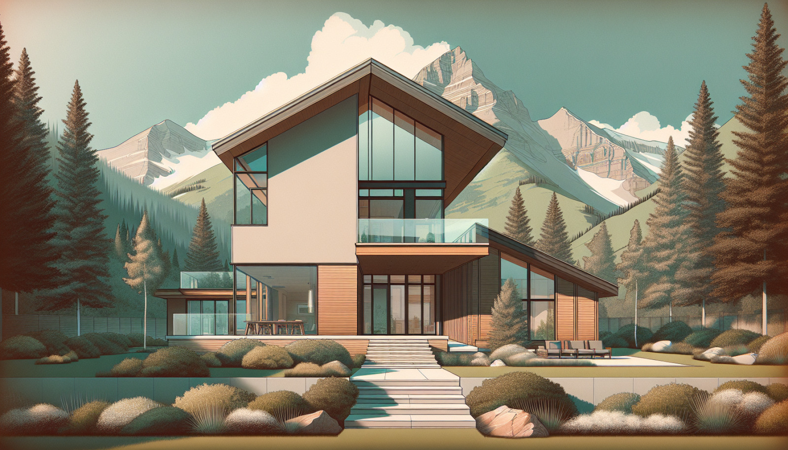
Best Paint Colors for Selling an Aspen, Colorado House: Exterior Facelift
The Curb Appeal Factor in Aspen, Colorado's Real Estate Scene
Exterior paint color is vital in creating that crucial first impression. It can set your home apart or cause it to blend seamlessly in a lush mountain setting.
Aspen, Colorado Exterior Colors That Blend with the Neighborhood Style
Colors that echo nature—like deep greens, slate blues, or warm browns—can complement Aspen’s picturesque surroundings.
Pops of Color: Aspen, Colorado Front Doors as Focal Points
Using bold colors on front doors can provide a lively contrast to neutral exteriors, offering an inviting charm.
Specific Exterior Paint Color Picks for Aspen, Colorado Homes
Earthy tones like "Mountain Forest Gray" or "Woodland Brown" are excellent choices for an exterior palette that highlights Aspen's breathtaking natural beauty.
By following these tips and leveraging Christine Belin's local expertise, homeowners can enhance their property’s value and appeal to potential buyers, ensuring that their home stands out in Aspen, Colorado's competitive real estate market.