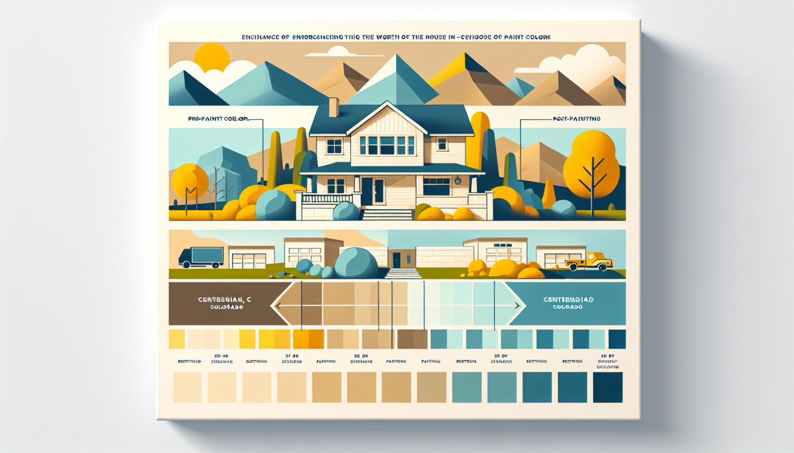
Transforming your home into a real estate gem goes beyond staging and landscaping; it starts with your choice of paint colors. For residents of Centennial, Colorado, understanding how to select the perfect hues to enhance appeal and increase market value is crucial. This guide will take you through essential paint selection strategies that align with Centennial's unique characteristics.
Elevating Your Centennial, Colorado Home's Value Through Paint Color Selection
Understanding the Impact of Paint Colors on Home Value in Centennial, Colorado
In Centennial, Colorado, a strategic paint choice can significantly impact your home's market value. Buyers often form first impressions based on aesthetics, with color being a critical element. Neutral, well-chosen colors can create a sense of warmth and universal appeal, drawing in potential buyers who can easily imagine themselves inhabiting the space.
Choosing the Right Paint Colors for Maximum Appeal and ROI in Centennial, Colorado
Achieving maximum return on investment (ROI) requires selecting colors that not only appeal broadly but also complement Centennial's vibrant natural surroundings and architectural styles. Opt for palettes that reflect the stunning Rocky Mountain views or resonate with the sophisticated suburban vibe.
General Rules for Painting Your Centennial, Colorado Home Before Listing
1. Opt for Neutral Paint Colors in Centennial, Colorado
The Universal Charm of Neutral Tones in Centennial, Colorado
Neutral tones are timeless and versatile, providing a soothing backdrop that appeals to a majority of buyers. Shades like greige (a blend of gray and beige), soft taupes, and classic whites are particularly effective in bridging personal taste with broad acceptance. These colors subtly enhance natural light—a cherished feature for Colorado homes.
Creating a Neutral Canvas: Key to Selling Your Centennial, Colorado Home
Neutral colors create a blank canvas that allows potential buyers to project their vision of home. This is especially important in Centennial, where the housing market benefits from a blend of contemporary and classic designs. Simple, understated neutrals can harmonize diverse design elements by offering continuity and cohesion.
Avoiding Bold and Distracting Colors in Centennial, Colorado
While personal expression through bold colors is welcome in art, real estate calls for restraint. Neighborhoods in Centennial vary from modern complexes to rustic abodes, and using bright or overly unique colors can alienate prospective buyers. Stick to underrated palettes to maintain a broad market appeal.
2. Consider the Undertone: A Centennial, Colorado Perspective
The Significance of Undertones in Centennial, Colorado Home Painting
Undertones—the subtle hues that underpin paint colors—play a secret yet definitive role in how a color is perceived. In Centennial, understanding whether a paint color leans warm (red or yellow undertones) or cool (blue or green undertones) helps in creating the right emotional response and complements local architecture.
Undertones That Harmonize with Centennial, Colorado's Unique Features
The rich natural palette of Centennial—from its lush parks to snow-capped mountains—should inform your choice of undertones. Opt for warm undertones to resonate with sunny days or cool tones to reflect the crisp winter air. These choices connect the interior spaces with the expansive outdoors, a critical point of harmony.
Selecting Warm, Cool, or Neutral Undertones for Centennial, Colorado Homes
Choose warm undertones if your home receives ample sunlight; these will create cozy interiors. Cooler undertones can contrast beautifully with natural woodwork found in many Centennial homes, adding modernity and depth. Neutral undertones offer easy versatility and can be the safest choice if you’re unsure.
3. Follow Centennial, Colorado Neighborhood Trends
Gauging Paint Color Trends in Centennial, Colorado's Real Estate Market
Staying updated with neighborhood trends ensures that your home is competitive in Centennial’s market. Visit open houses, browse neighborhood listings, and chat with local realtors like Christine Belin to understand current color preferences that could make a difference.
Balancing Personal Preferences and Centennial, Colorado Community Expectations
While personal preferences are significant, ensure they don't overshadow community standards. A balance allows your home to stand out while fitting seamlessly within Centennial's aesthetic frameworks, whether in newer developments or established communities.
Adapting to Centennial, Colorado Architectural Styles and Neighborhood Vibes
Recognizing Centennial's plethora of architectural styles—from Craftsman to Mid-Century Modern—can guide your paint selections. Each style has its own color affinities, and aligning your colors with these can enhance cohesion and value perception.
Best Paint Colors for Selling a Centennial, Colorado House: Room By Room
Common Areas: Living, Dining, and Hallways in Centennial, Colorado
The Great Gray vs. Beige Debate in Centennial, Colorado
Gray has surged in popularity, but in Centennial, both gray and beige serve as excellent choices for common areas. Gray can add a touch of sophistication, while beige can maximize warmth—both vital for spaces meant for gathering.
The Allure of Warm Gray Tones: A Centennial, Colorado Favorite
Warm grays can beautifully straddle the line between cozy and chic, particularly suitable for Centennial's style dichotomy. Implement these in high-traffic areas to present a polished yet inviting ambiance.
Top Paint Color Recommendations for Centennial, Colorado Common Areas
Consider hues like Revere Pewter, Accessible Beige, or Worldly Gray. These offer the right balance of warmth and neutrality, making them versatile for living and dining rooms as well as hallways.
Centennial, Colorado Kitchen Painting Strategies
Coherence Across Centennial, Colorado Homes: Consistency is Key
Maintain coherence by ensuring kitchen colors echo those of common areas. This consistency prevents disjointed transitions and enhances flow, critical in open-concept designs.
Adding Dimension to Centennial, Colorado Kitchens: Creative Shade Choices
Incorporate softer greens or blues for depth without overwhelming the space. These colors can subtly enhance modern appliances or rustic wood finishes commonly seen in Centennial kitchens.
Centennial, Colorado Cabinet Painting: Safety in White or Other Options
White remains a classic for cabinets due to its clean, modern look and ability to reflect light. If adventurous, opt for navy or forest green—a rising trend offering personality without overcommitment.
Bedrooms: Centennial, Colorado's Unique Considerations
The Role of Bedrooms in Centennial, Colorado Homebuyer Decisions
Bedrooms must evoke restfulness yet be stylish enough not to feel dull. They are sanctuaries within the home where buyers visualize retreat and relaxation.
Cost-Effective Bedroom Repainting: A Centennial, Colorado Analysis
Given varying preferences, consider using cost-effective and neutral colors like light pastels or deeper earth tones that can be easily updated by future owners.
Consulting Centennial, Colorado Real Estate Experts on Bedroom Colors
Engage with real estate experts to understand buyer demographics and preferences. Christine Belin, a seasoned realtor, can provide invaluable insights on strategic color choices.
Bathroom Paint Choices in Centennial, Colorado
Centennial, Colorado Bathroom Design: A Touch of Personality
Bathrooms offer a chance to indulge in subtler versions of richer tones. Light blues, sage greens, or soft lavenders can add personality while maintaining tranquility.
Coordinating Centennial, Colorado Bathroom Colors: Options and Effects
Align bathroom color schemes with tile or countertop styles. Light neutrals paired with soft accent colors keep spaces fresh and airy – a real selling point.
Top Bathroom Paint Recommendations for Centennial, Colorado Homes
Select colors like Sea Spray or Ballet Slipper—pastels that nod to luxury and serenity. A well-chosen bathroom palette can be a major selling feature.
Best Paint Colors for Selling a Centennial, Colorado House: Exterior Facelift
The Curb Appeal Factor in Centennial, Colorado's Real Estate Scene
Curb appeal is paramount in attracting potential buyers from the outset, making exterior paint color critical. Choose colors that complement the surroundings and architecture while standing out just enough.
Centennial, Colorado Exterior Colors That Blend with the Neighborhood Style
Earthy tones like taupe, slate, or forest green resonate with Centennial's landscape. These colors echo the natural beauty of Colorado and can tie architecture to the land.
Pops of Color: Centennial, Colorado Front Doors as Focal Points
Make a statement with your front door. While keeping exterior colors understated, consider bright reds, deep blues, or bold yellows—enhancing visual interest and guiding buyer focus.
Specific Exterior Paint Color Picks for Centennial, Colorado Homes
Exterior palettes like Classic Swiss Coffee for siding with a Pottery Red door offer timeless charm, balancing tradition with modern vivacity, perfect for Centennial homes.
Choosing the right paint colors can shape perceptions, guide emotions, and ultimately define the saleability of your home in Centennial, Colorado. For tailored advice and further inquiries, turn to experts like Christine Belin | Evernest, LLC. With the right guidance, your paint choice will become an asset, seamlessly increasing value and appeal.