Elevating your home’s appeal through paint can significantly increase its value in Littleton, Colorado. With the right color selections, potential buyers will be drawn to the visual aesthetics and may even perceive higher value, leading to quicker sales. Christine Belin at Christine Belin | Evernest, LLC offers insights into futureproofing your home investments through strategic paint choices that cater specifically to the Littleton area.
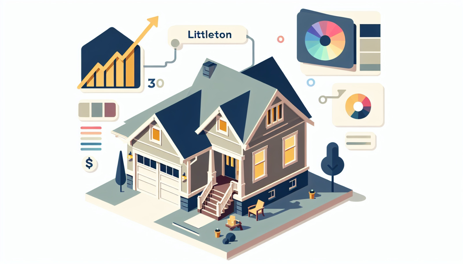
Elevating Your Littleton, Colorado Home's Value Through Paint Color Selection
Understanding the Impact of Paint Colors on Home Value in Littleton, Colorado
Paint colors do more than cover surfaces; they influence the perceived size, warmth, and overall ambiance of spaces. In Littleton, Colorado, where buyers might be drawn to homes that blend with the natural beauty of the Rockies, color plays a crucial psychological role. Colors can impact how light reflects within rooms, making spaces appear larger or cozier – features that are highly valued among Littleton buyers. Choosing the right colors elevates your home's marketability, making it a contender in a competitive market.
Choosing the Right Paint Colors for Maximum Appeal and ROI in Littleton, Colorado
To maximize both appeal and return on investment (ROI), focus on colors that resonate with broad sensibilities while highlighting Littleton's unique landscape. An understanding of local tastes, combined with neutral, universally appealing shades, can position a home as a desirable move-in-ready option. Colors that evoke the sky, stone, or foliage, such as muted blues and greens or soft taupes, often integrate well with Littleton's environment, emphasizing connections with nature that many buyers cherish.
General Rules for Painting Your Littleton, Colorado Home Before Listing
1. Opt for Neutral Paint Colors in Littleton, Colorado
The Universal Charm of Neutral Tones in Littleton, Colorado
Neutral tones like soft whites, light grays, and beiges offer a blank yet welcoming canvas that allows buyers to envision personalizing the space. In Littleton, where homebuyers range from young professionals to retirees, neutral palettes provide a flexible design foundation, appealing across demographics by being neither too bold nor too bland.
Creating a Neutral Canvas: Key to Selling Your Littleton, Colorado Home
A well-appointed neutral interior provides potential buyers with a sense of tranquility and potential. This "neutral canvas" approach stands out in online listings and open houses, making your property shine in the Littleton real estate marketplace.
Avoiding Bold and Distracting Colors in Littleton, Colorado
While artistic expressions in paint can be tempting, bright or unconventional colors can distract or deter buyers. A prospective homeowner might see bold hues as additional work or expense to change, which can negatively impact the perception of value.
2. Consider the Undertone: A Littleton, Colorado Perspective
The Significance of Undertones in Littleton, Colorado Home Painting
Undertones can entirely shift the perception of a color under different lighting conditions. For Littleton homes, understanding which undertones (warm, cool, or neutral) will harmonize with the local climate and lighting is critical. The region's abundance of natural light can amplify undertones, making them look different than expected.
Undertones That Harmonize with Littleton, Colorado's Unique Features
Consider choosing colors with undertones that complement the natural surroundings, like the subtle warmth of a rocky landscape on an autumn evening. This ensures your home blends with the peaceful Littleton community aesthetics, marrying inside spaces with the views beyond the windows.
Selecting Warm, Cool, or Neutral Undertones for Littleton, Colorado Homes
Whether you lean toward warm yellows and soft browns or cool blues and silvery grays, ensure the undertones reflect the vibe of the Littleton neighborhood you are part of. A picturesque alignment makes homes feel at peace with their setting.
3. Follow Littleton, Colorado Neighborhood Trends
Gauging Paint Color Trends in Littleton, Colorado's Real Estate Market
Understanding popular color trends can offer a competitive edge. In Littleton, trendy colors may often reflect a taste for earth tones, muted greens, or contemporary shades of chic whites. These choices resonate with many residents' preferences for refined yet adventurous living spaces.
Balancing Personal Preferences and Littleton, Colorado Community Expectations
While personal taste should never be discounted, when selling, align your choices with local norms without losing touch with what makes your property unique. The right balance can showcase your home's potential while respecting community standards.
Adapting to Littleton, Colorado Architectural Styles and Neighborhood Vibes
A cohesive look that respects the architectural style of your home—be it modern ranch, craftsman, or Victorian—will reinforce your property’s strengths. Ensuring color choices echo neighborhood vibes can significantly impact the perceived willingness to integrate with community culture.
Best Paint Colors for Selling a Littleton, Colorado House: Room By Room
Common Areas: Living, Dining, and Hallways in Littleton, Colorado
The Great Gray vs. Beige Debate in Littleton, Colorado
Choosing between gray and beige sets the tone for versatile common areas. In Littleton, where natural light is abundant, a warm gray can add sophistication and even warmth, while beige might offer a timeless simplicity.
The Allure of Warm Gray Tones: A Littleton, Colorado Favorite
For Littleton homes, warm grays are gaining traction due to their ability to harmonize with varied finishes like stone fireplaces or wooden beams, adding urban elegance without being stark.
Top Paint Color Recommendations for Littleton, Colorado Common Areas
Consider Benjamin Moore’s Revere Pewter, a reliable greige, or Sherwin-Williams' Accessible Beige for a classy neutral. These colors work well with natural light and are complementary to many furniture styles.
Littleton, Colorado Kitchen Painting Strategies
Coherence Across Littleton, Colorado Homes: Consistency is Key
Consistency in paint color can unify elements within kitchens and connect them with adjoining spaces. Repeating wall colors or using complementary shades keeps transitions smooth and visually appealing.
Adding Dimension to Littleton, Colorado Kitchens: Creative Shade Choices
Incorporate darker tones on lower cabinets and lighter ones on walls to add depth and contrast—keeping the look approachable yet chic. Pay attention to complementary colors for backsplashes or countertops to complete the palette.
Littleton, Colorado Cabinet Painting: Safety in White or Other Options
White cabinetry remains a timeless choice but don’t shy away from soft greens or navy blues if they enhance your current hardware and surroundings—a fresh, clean look can be either traditional or trendsetting depending on execution.
Bedrooms: Littleton, Colorado's Unique Considerations
The Role of Bedrooms in Littleton, Colorado Homebuyer Decisions
Bedrooms are personal sanctuaries for Littleton buyers. Choosing serene colors like softer blues or gentle greens provides a relaxing retreat—a quality many prospective homeowners cherish.
Cost-Effective Bedroom Repainting: A Littleton, Colorado Analysis
Repainting with broader appeal in mind ensures cost-effectiveness in the long run, circumventing needed changeovers while hosting years of aesthetic comfort for the new occupants.
Consulting Littleton, Colorado Real Estate Experts on Bedroom Colors
Christine Belin’s expertise can guide you in picking colors that enhance perceived space value, offering strategic choices tailored to increase buyer interest and engagement.
Bathroom Paint Choices in Littleton, Colorado
Littleton, Colorado Bathroom Design: A Touch of Personality
Bathrooms are perfect for indulging in colors that express subtle personality—think soft peach, pale blue, or lavender that can enliven without overwhelming.
Coordinating Littleton, Colorado Bathroom Colors: Options and Effects
Coordinating bathroom colors with tiles, fixtures, and flooring ensures cohesion. The right hues can make even compact bathrooms feel brighter and more expansive.
Top Bathroom Paint Recommendations for Littleton, Colorado Homes
Soft neutrals such as Sherwin-Williams’ Sea Salt offer a whisper of color that is approachable and relaxing. Pair with crisp white trims or textured tiles for a polished look.
Best Paint Colors for Selling a Littleton, Colorado House: Exterior Facelift
The Curb Appeal Factor in Littleton, Colorado's Real Estate Scene
Color impacts first impressions significantly. An attractive exterior color palette can enhance your property’s curb appeal—critical for drawing initial buyer interest.
Littleton, Colorado Exterior Colors That Blend with the Neighborhood Style
Echo local landscapes by using earthy tones or muted colors that complement the picturesque backdrops of Littleton. Soothing exteriors project a welcoming atmosphere and reflect the community's harmony with nature.
Pops of Color: Littleton, Colorado Front Doors as Focal Points
Adding a visually appealing shade to your front door—like a bold red, rich navy, or vivid yellow—can attract and accommodate an eye-catching focal point that invites guests to explore the interior.
Specific Exterior Paint Color Picks for Littleton, Colorado Homes
Consider exterior paints such as James Hardie’s Timber Bark or Sherwin-Williams’ Bungalow Beige to merge modern elegance with timeless tradition, ensuring your home stands out for all the right reasons.
In conclusion, selecting the right paint colors for your Littleton, Colorado home can elevate its value significantly. Christine Belin, with her extensive knowledge and keen eye for detail, can assist you in making these vital choices. By considering the unique aspects of Littleton's environment and community, your home's appeal will be enriched, ensuring it resonates with potential buyers and stands out in the Littleton real estate market.